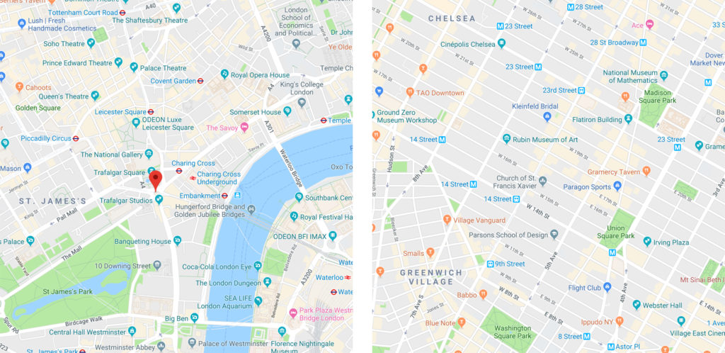
There are many different kinds of cities throughout the world. Some, such as London or Rome, have evolved over many centuries, with little planning. While they are famously charming, getting around such places can be daunting. On the other hand, modern cities tend to be designed on a grid system, allowing for more logical planning and, more importantly, navigation.
When it comes to software, a lack of planning can lead to the same problems as unplanned cities. Think of the user’s eye as the driver of a vehicle in an unfamiliar city. The traveler is more likely to find the destination on a north-south, east-west grid, just as a software user can more easily find needed information on a carefully laid out screen.
Graphic designers have long used grids as a tool to help layouts make sense. While many think of grids as little more than a checkerboard, or lines on graph paper, they can be far more sophisticated. This helpful tool goes back as far as the Dead Sea Scrolls, or in printing, to the Gutenberg Bible, and continues forward to the present day, being widely used by modern designers.
A grid should be thought of as a design tool, not an unbreakable rule. There is nothing to say that you can’t make a box multiple columns wide, or insert a round object into a square drawn by grid lines. But by placing those objects within the grid’s pattern, they become esthetically more pleasing and easier to read.
In this article, I will give you samples of different types of grids, explain their benefits, and weigh the pros and cons of creating and using each one in FileMaker Pro Advanced. I will also give you some tips and shortcuts to make it easier.
Column Grids

This type of grid is one of the simplest. It’s just a set of evenly spaced columns with gutters running between them. This is the format you would find in newspapers and magazines, and it also lends itself well to user interface design. The idea is that the columns help you line up your fields and labels, text, portals, images, etc. in a vertical format. Let’s face it, much of our time as FileMaker developers is spent lining up little boxes. Not only will a grid like this help to keep everything tidy, but it will also make sure that every element is given enough room to breathe. There are a few things to consider with this type of grid.
How wide should my columns be?
There is no strict rule for column width. When you consider that objects can be many columns wide, you are free to go with a smallest common size approach. What’s the narrowest width you might assign to a field? Date fields are often narrower than other types; consider that as a starting point. However, this will lead to quite a few columns on a wide layout, and may be a bit distracting when laying out your page. You may want to try a couple of different ones until you find what works best for you.
What’s better: an odd or even number of columns?
This may depend more on the type of layouts you are creating. If you commonly divide your layouts into two even halves, side by side, you may do well with an eight or twelve column grid. But if you prefer to center things a lot, or you like to follow the rule of thirds*, 9 columns may suit you better.
How do I do the math for this?
Dividing your layout into even parts seems easy, but you have to take into account the fact that you will need a gutter on both edges of the layout. A 1920px layout (the width of 1080p) divides evenly into eight 240px columns, each including a 10px gutter. But you need nine gutters, not eight, so you will have to do some extra figuring to make it work (hint: reduce your column width by 2px and make your outer gutters on the left and right edges slightly larger. You’re welcome). For this kind of grid, you will have the option of using FileMaker’s native global guides.
Modular Grids

A modular grid is a column grid that has also has horizontal rows, making a sort of checkered pattern. The rows also have gutters. This kinds of grid makes it easier to break your data up into logical chunks. Personally, I don’t find these all that useful, but some people might relate to this better than a column grid. And, of course, all of the considerations about width, odd or even, and doing the correct math apply as above. This kind of grid is also easily achievable using FileMaker’s native guides.
A Few Notes on Guides
As I mentioned, guides can be made “global.” This is done by control- or right-clicking on a guide and choosing “Share Guide with All Layouts.” However, be aware of one huge lesson I learned the hard way: this will only “stick” if you are in single-user mode. If the file is hosted, your guides will revert to their original state the next time you open the file. You should also lock your guides as you go along, by right-clicking on them and choosing “Lock Guide.”
Also, if you want to make a set of evenly placed column guides, and you have done the math to determine exact column size, you can draw a box on the layout, color it gray, and use it as a sort of spacer as you work your way across the layout. You can also create a separate one of these for your gutters. Unfortunately, you can’t select a guide and nudge it – you can only use your mouse or trackpad to drag it around. This gets easier with practice, and the Position section of the Inspector is your friend here.
Hierarchical Grids

This grid type is more flexible and also more complex. It’s most useful when your overall design is more advanced and has various predefined areas for objects on the layout to reside. Say you have a large “main info” area that fills the top third of your layout, a button bar that spans the layout’s width beneath that, and three side-by-side columns in the lower section. You want to enforce this design paradigm across several screens to lend consistency to your app.
FileMaker’s native guides will not help you in constructing this grid, because the lines always extend from one edge to the other, and it will be a confusing layout to work in. This inability to use guides is a disadvantage in one way: you can’t snap your objects to the guides if they aren’t there. However, there is another way to solve the grid creation riddle, and it also has a surprising benefit.
Using a combination of features available in FileMaker Pro/Advanced 16 and 17, you can get as-good or better results using Shape objects – rectangles – in place of columns. This works well because objects are already aware of one another on the layout, meaning that helpful alignment hints will appear as you align edges or centers. This is just about as good as aligning to guides. You have to do four things to make this work smoothly:
- Give each of these grid object special names that identify them as such in FileMaker’s layout objects palettes (FMPA 17 and above).
- In the Data pane of the inspector, enter a 1 for each object in the “Hide object when” field. This will prevent these grid objects from displaying in any but Layout mode.
- Send to the back of the layout (Arrange menu, Send to Back).
- Lock them and never unlock them again, unless you have to make adjustments when you are first working things out.
Another really big benefit to this method is that you can have more than one of these hierarchical grids. When you set guides to be global in FileMaker, they are just that: global, appearing exactly the same on every layout, whether it’s a card window, a list view, or a report. This can be very limiting. With the hierarchical grid, you can have one for dashboards, one for main data entry layouts, one for list views, and one for card windows. Or, a set of these for each type. Mix ’n match! have a grid party!
Leveraging grids in your own design
Whatever method you choose, a grid will make things easier in the long run. As with all things in design, a little forethought and a bit of work will pay off in a big way. If your UI design tends to look like medieval civilization took over, a good grid plan will tighten things up nicely. If design is a serious consideration and yet a constant struggle, using a grid will help make more sense of it all. Remember to think of the user’s eye as a traveler, and the grid as efficient traffic planning. Do you want to direct the eye to move down and then across in columns? Do you want users to read across the top first, then down? Your grid can help you plan for this.
There are other adjustments you can make. Do your layouts tend to look crowded with columns of information too close to one another? Consider adjusting the width of the gutters, to give the whole thing more air. Is there a need to size up the font size for older users with vision challenges? Maybe you will need fewer, wider columns.
Your iOS grids for use in FileMaker Go will likely look very different from a desktop grid, but they are equally important. iOS users need larger landing zones for their fingers; your grid can help you with that. iOS users not only need the same eye-travel ease as desktop users, but they also need to interact directly with the screen. In other words, the fingers have to follow the eyes. Your grid can help with that traffic flow as well.
As you have seen here, designing on a grid can make your app a better experience for your users, no matter how you design it. The only rule you need to follow is use a grid! What that grid looks like is entirely up to you.
*Rule of thirds post coming soon.
Recent Comments