
In a previous article, I explained how designing on a grid can make the task of designing layouts easier and, more importantly, a better experience for your users. I also alluded, briefly, to the “Rule of Thirds.”
What is it?
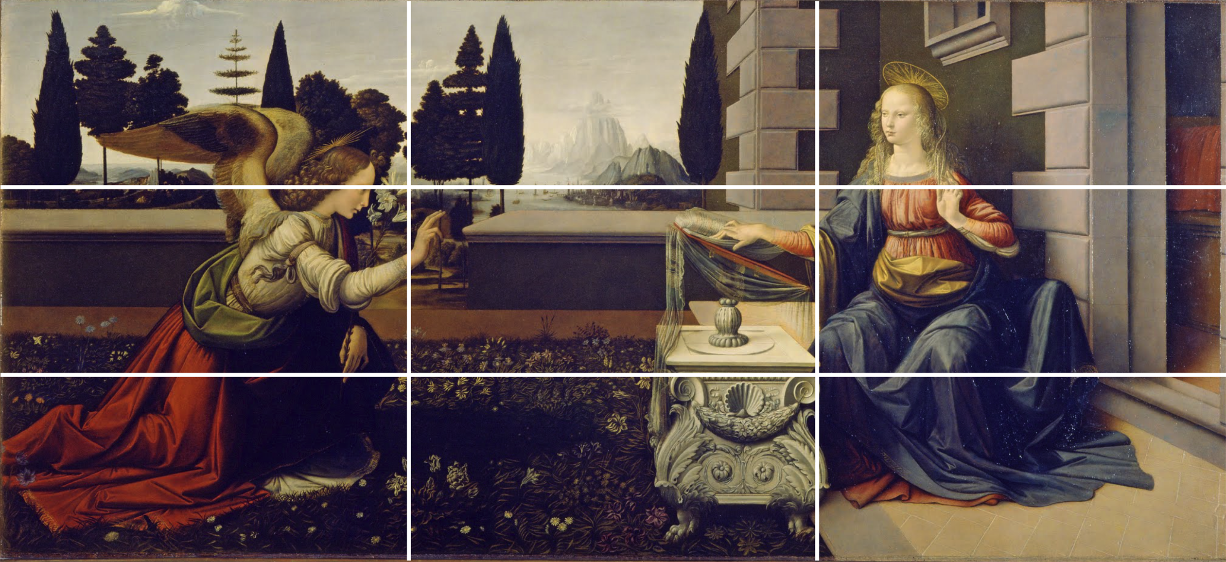
The Rule of Thirds is a term that originally applied to painting, later to photography, and is now used in design as well. It is based on the idea that perfect half-and-half symmetry is boring, and that images become more dynamic when the main subject is placed about one-third of the way from the left or right, top or bottom, or both edge(s).
How to Use It
In design, it’s used a little differently. If design is mainly about presenting information in a meaningful and organized manner, the Rule of Thirds is about having a way to divide up that information so that it is intuitively understood by the user. To my eye, when I see a window divided in half, my first thought is that I am being presented with a binary comparison: this or that? If this is not actually what’s going on, I first have to make a mental adjustment before I can reassess the information. When presented with information divided into thirds, such considerations never occur to me. Instead, I begin to understand things based on other factors that are more within the control of the designer.
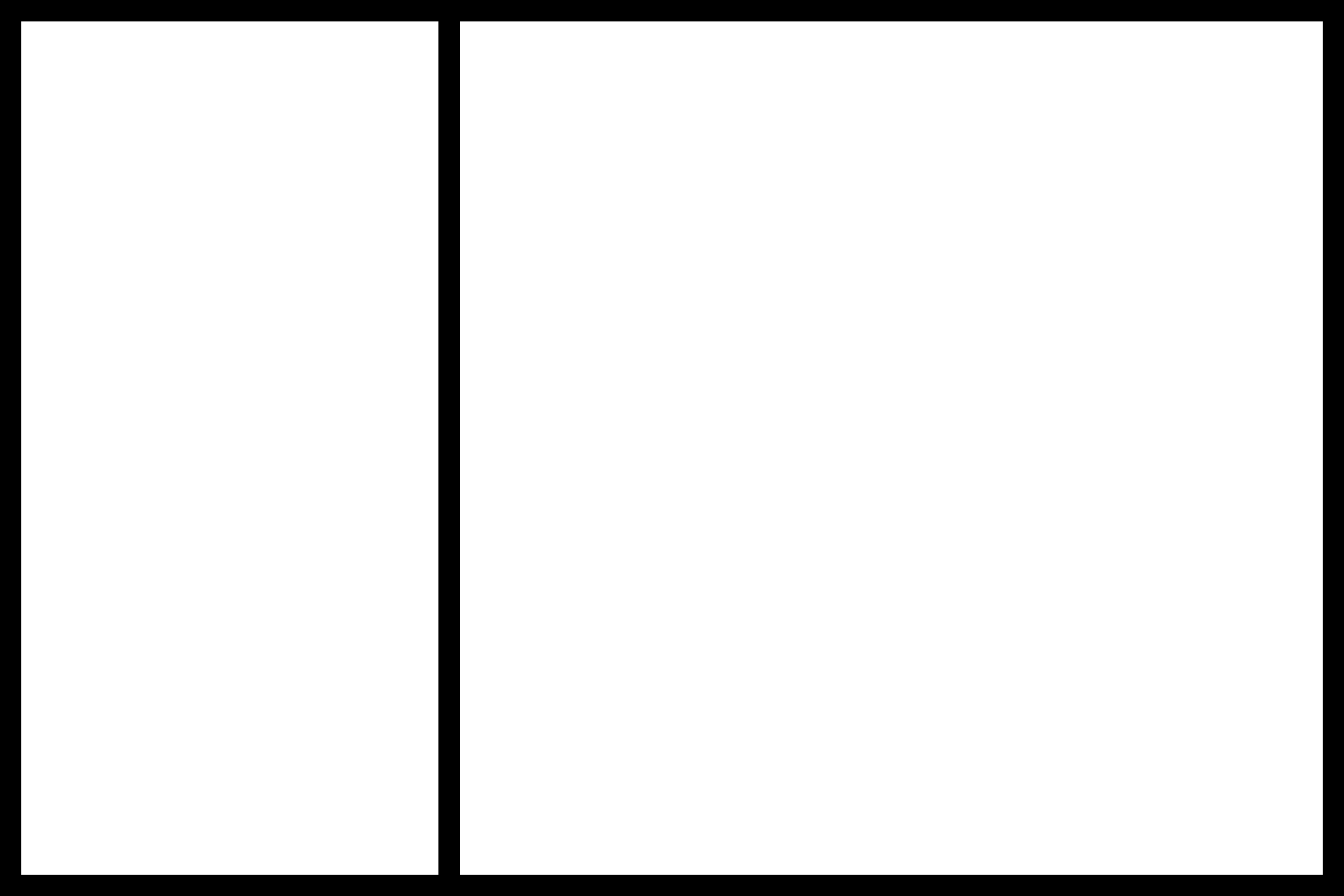

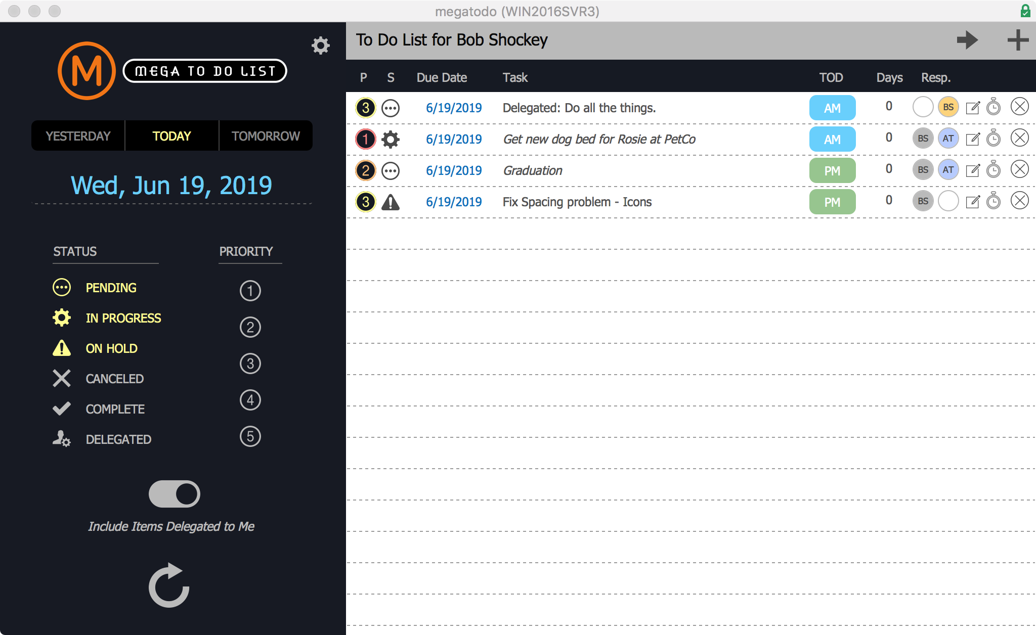
Take a look at the screen shot from MegaToDo (a free to do template you can download here). The layout has been divided into thirds horizontally, so that the left third acts as a set of controls for the right section, which composes the other two thirds. This gives the impression of stability to the layout. I could have made the left column use a quarter of the screen, and it would have worked out fine. But in this design pattern, the importance of the controls on the left is not diminished. The user understands that the thing on the left directly influences the thing on the right, that it’s part of the process of using the app.
Dynamic Tension
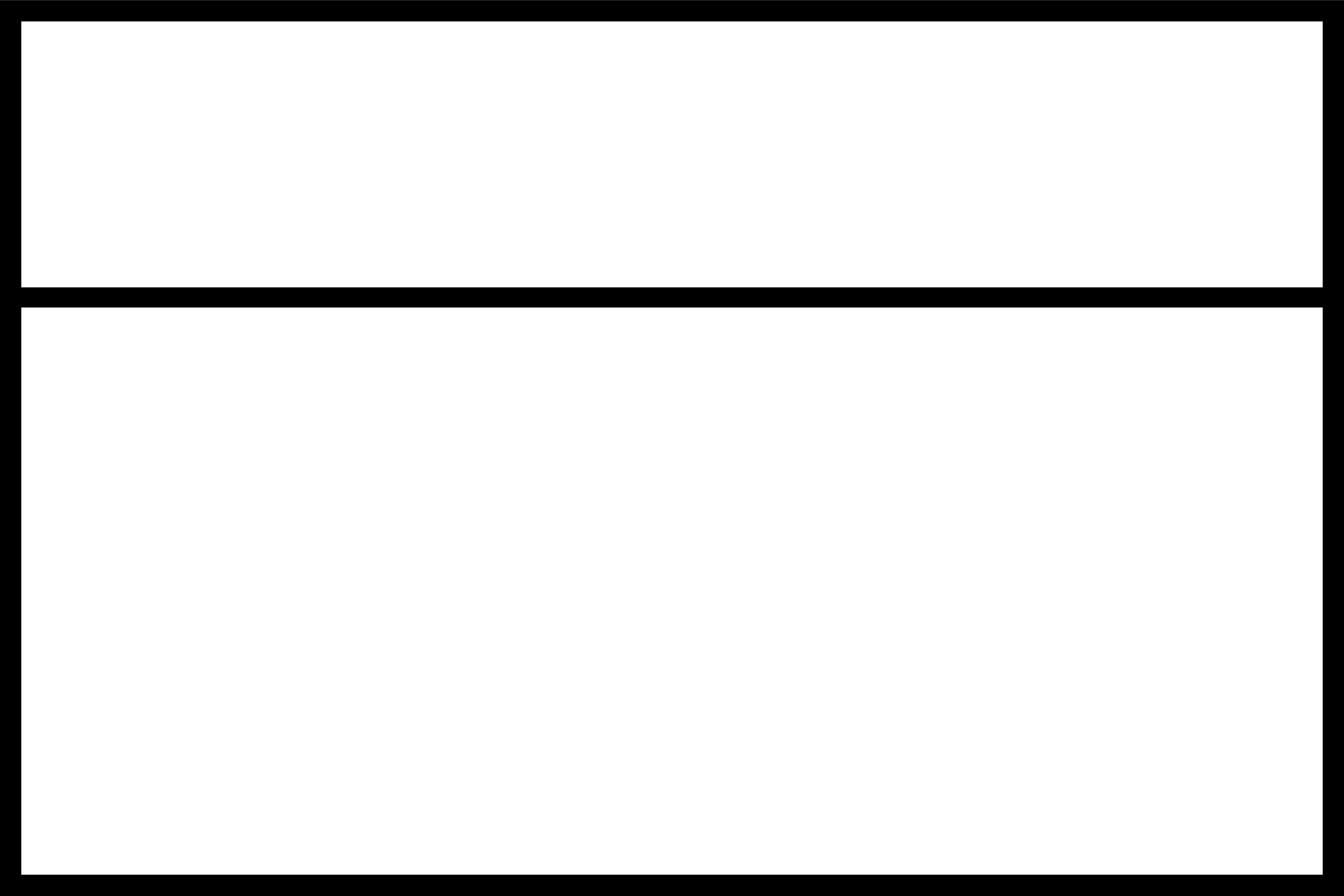
There is another element to this kind of segmenting of the design surface. Where the horizontal and vertical lines intersect, four points are created. In a photo or a painting, these are considered to be dynamic points, where the placement of objects causes tension, drama, or a sense of movement. In a layout containing data, there’s a more complex, but equally important principle at play: these points represent natural landing places in the screen area for the eye to travel. The circled numbers represent how the eye might travel, but this is controlled by the elements you place on the layout. If you have a large horizontal object in the top third, the eye might follow that across the page instead.
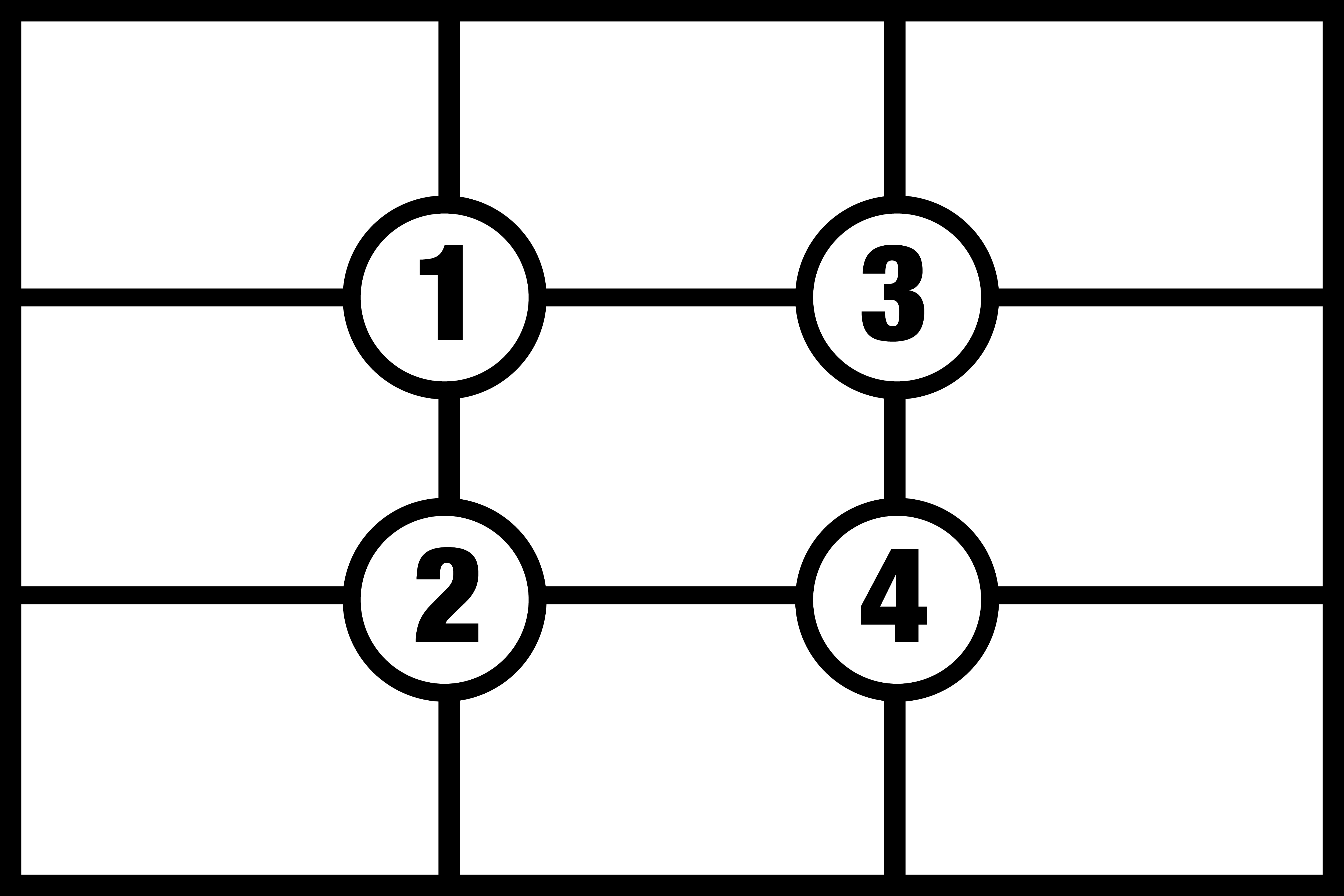
In the Western world, people tend to start at the top left of the page or screen. The eye then travels right for a bit, then down the left side. This is not a guess — much research has been done with eye-tracking devices and humans to produce heat maps that illustrate eye movement. From these, we can discern where the eye lands in relation to each of these regions. In other words, all parts of your screen are not equal. By subdividing your screen into the nine regions produced by the Rule of Thirds, you can prioritize the placement of your data.
Conclusion
Organizing information on a screen is not easy — organizing a bunch of text boxes, number columns, graphics, and other data points can feel a lot like herding cats. Having some sort of organizational method will make it easier. Whether you create a totally custom grid like my previous article, or adhere to the Rule of Thirds, you will find that things fall into place more easily. Give it a shot and hit me up in the comments to let me know how it works for you!
Recent Comments